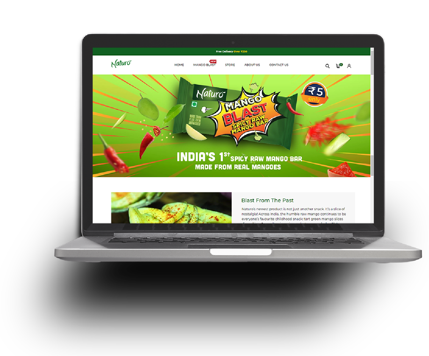
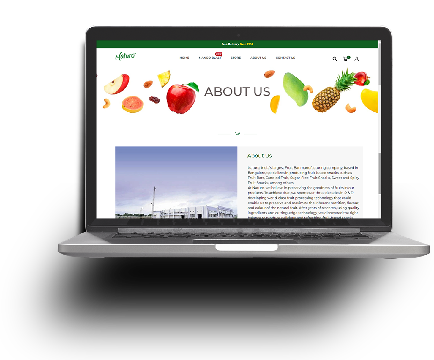
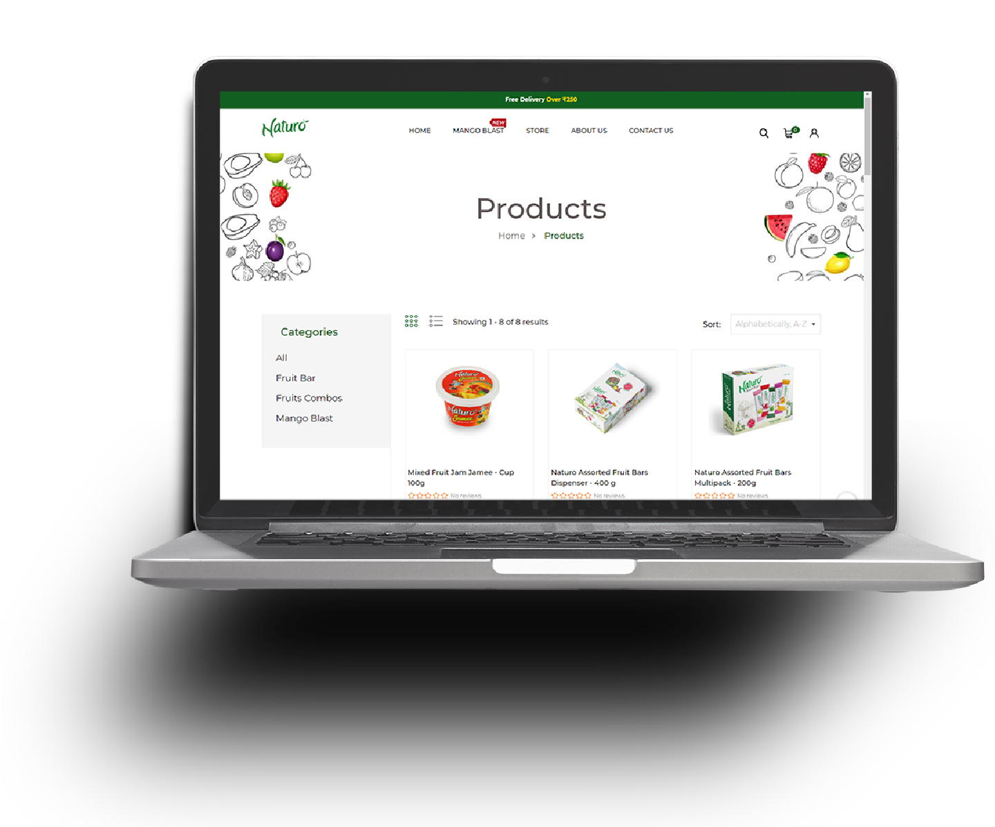
Since natural fruit favouring is the key component of the products, we obviously zeroed in on showcasing Naturo’s packaging and highlighting its flavour combinations. We used a shopify theme and customized the design with a palette of colours to represent the different flavours. This made the products literally ‘pop’ out of the page. We did, however maintain dark green as the dominating colour to be in sync with the brand logo while carefully building the website – from ground up. The result, an elegant, intuitive and clean eCommerce portal.