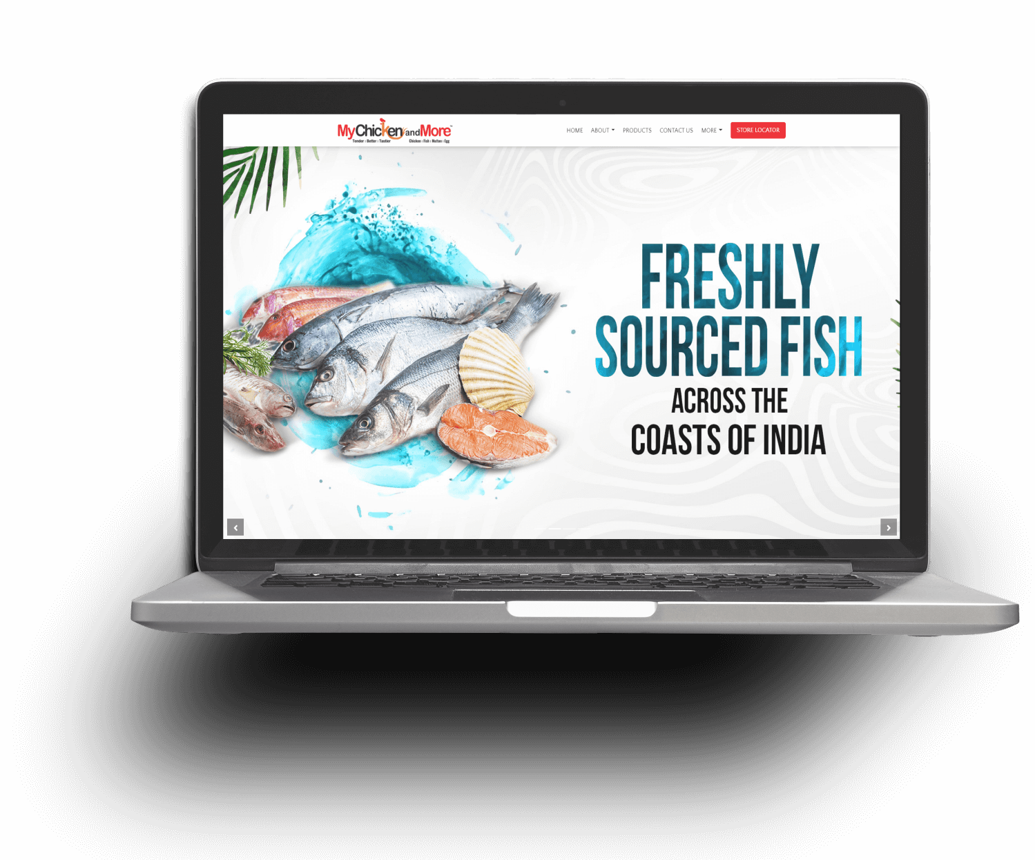
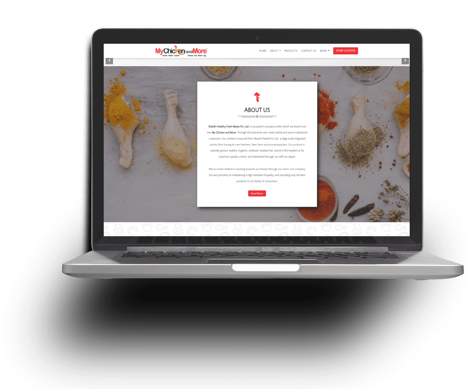
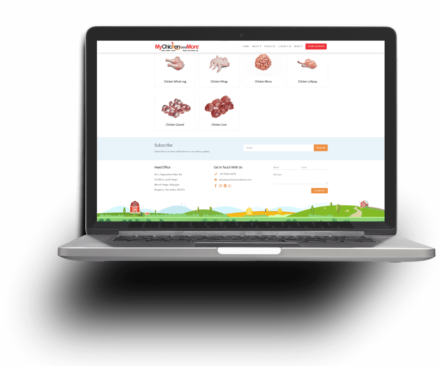
While building the website for My Chicken & More, the team had plans clearly laid out

  • It had to be so appealing to the meat lover, that he or she is induced to spend time going through its pages
  • It should clearly define the products and offers in in store
  • It should reiterate the freshness quotient of the products
  • It should build awareness regarding outlets, the promoters and the future plans.

Design

  • Experience Design
  • UI Design
  • Content Creation

Development

  • Frontend Development
  • UI upgradation
  • Product filter

Tech Stack

  • Bootstrap
  • PHP
  • JQuery

Strategy

  • Web architecture
  • User experiencee
  • Code upgrade

Testing

  • Optimization
  • Compatibility
  • Functionality
  • Faster loading website on the browser
  • Mobile first approach for UI design
  • Increased number of users on the website
  • Responsive and browser compatible design.

Since its launch, this page in particular has performed well. Lots of customers have considered the offer and are ordering through the portal.

75%

New Users

80%

Engagement

25+

Reviews

<