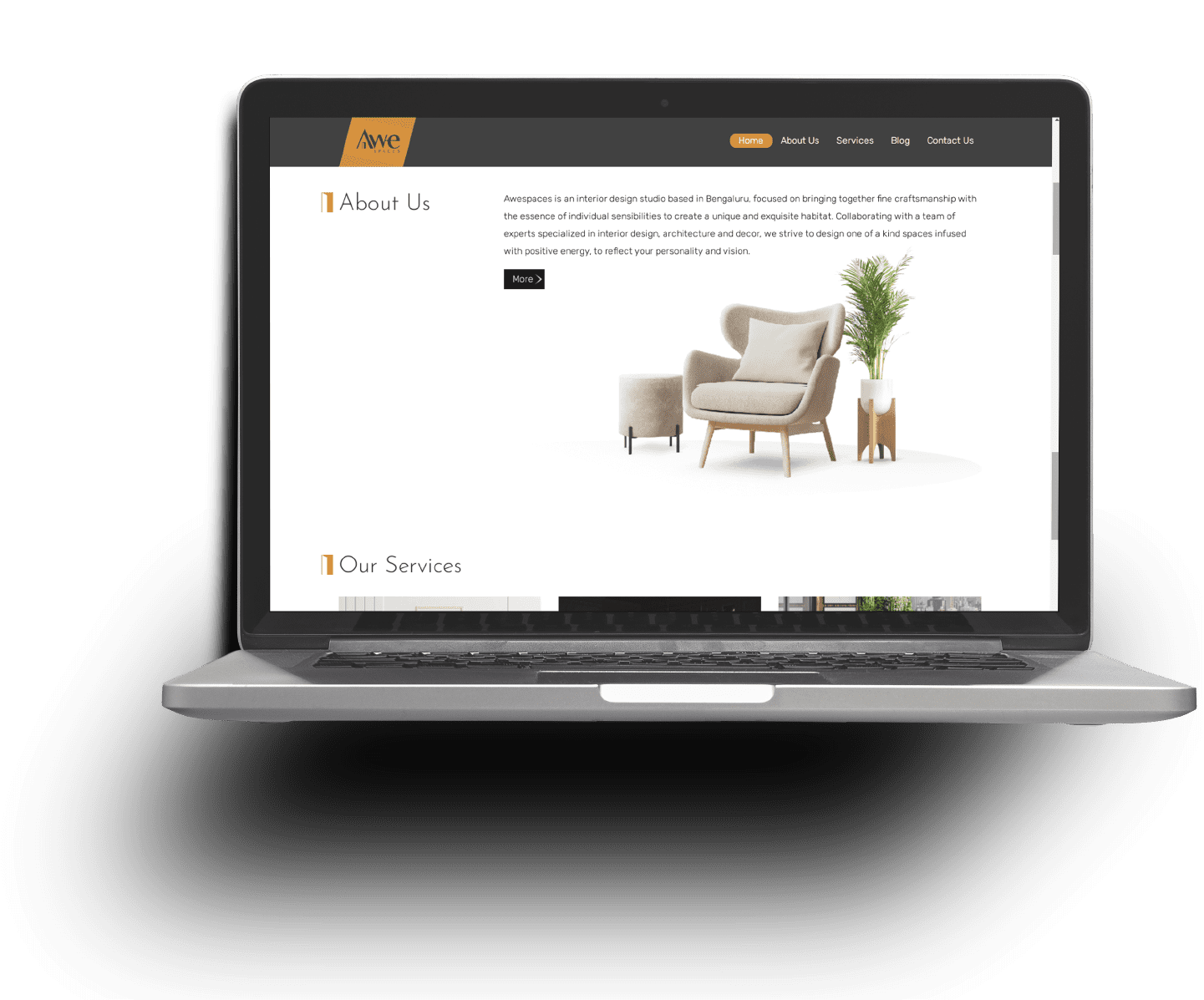
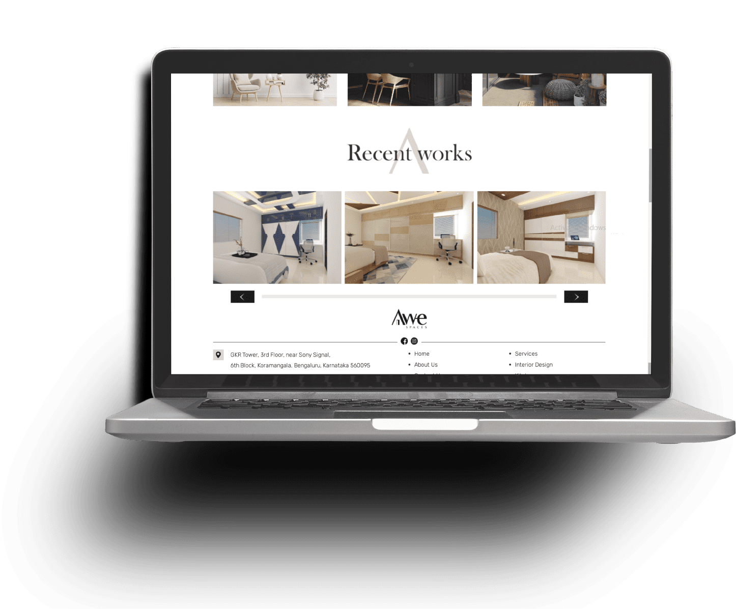
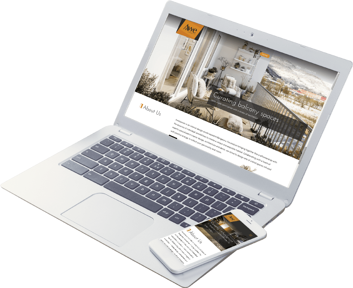
Awespaces strives to create one of a kind spaces infused with positive energy. So we had to make sure that the website reflected their design ethos. We chose white and grey as the primary colours to represent calm & peace and used ochre to add a subtle contrast. We also included many interior images to highlight the brand’s services. On the whole, this website, built from scratch, embodies the brand that is a blend of style and function.
Design

  • Experience Design
  • UI Design
  • Content Creation

Development

  • Frontend Development
  • Backend Development
  • Responsiveness

Tech Stack

  • Bootstrap
  • JQuery
  • PHP

Strategy

  • Web architecture
  • User experience
  • Competition Research

Testing

  • Optimization
  • Compatibility
  • Functionality
  • Develop a portfolio website for an interior designing company
  • Showcase the company services
  • Integration of enquiry forms for service requests
  • Regular meta-tag updates for better SERPs
  • Increase in website traffic flow.

Since its launch, the website has witnessed a decent inflow of traffic. While it keeps customers informed on all of Awespaces’ services, it is also a platform for potential customers to reach out to.

80%+

Engagement

60+

Responses

50+

Traffic

<